.svg)

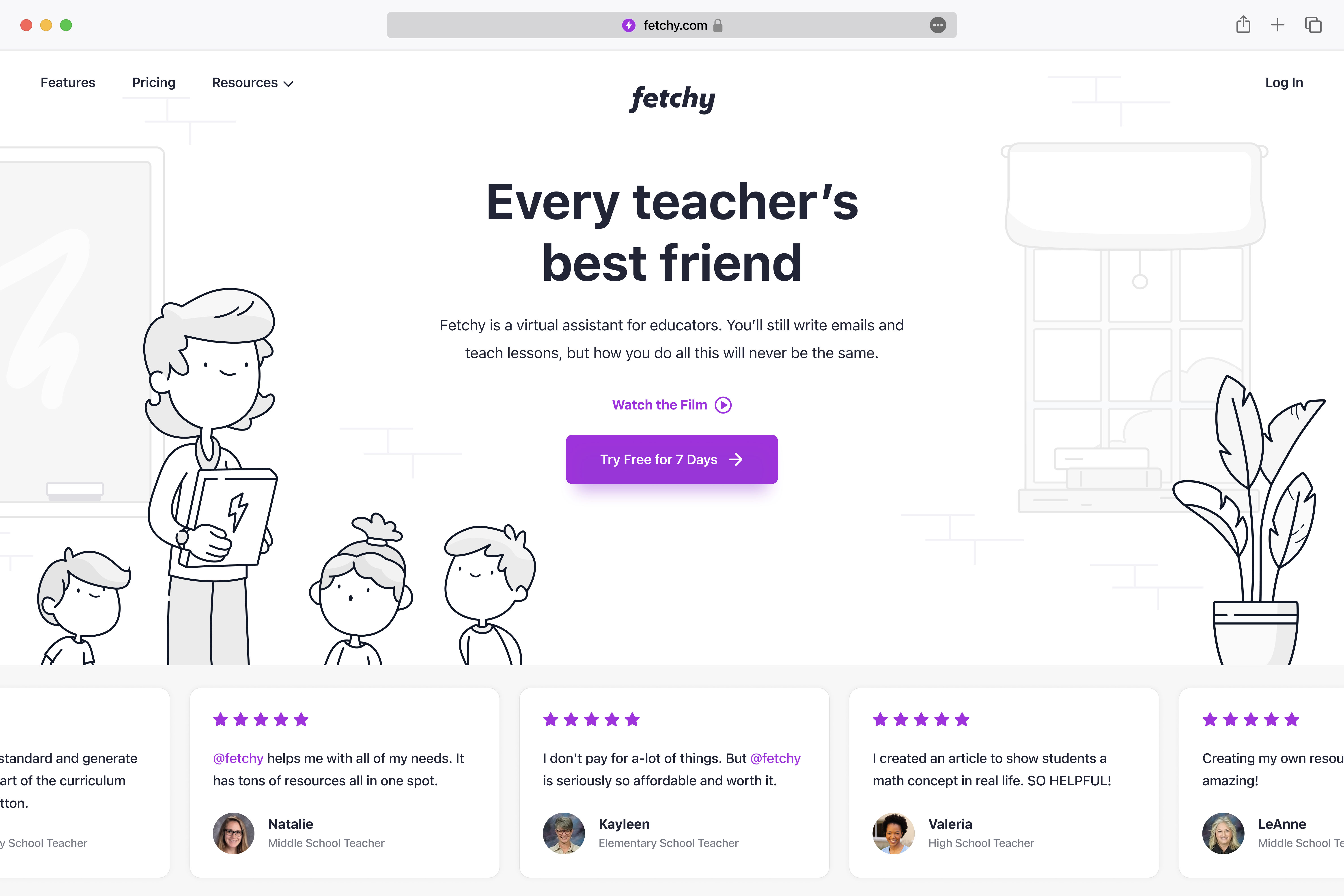
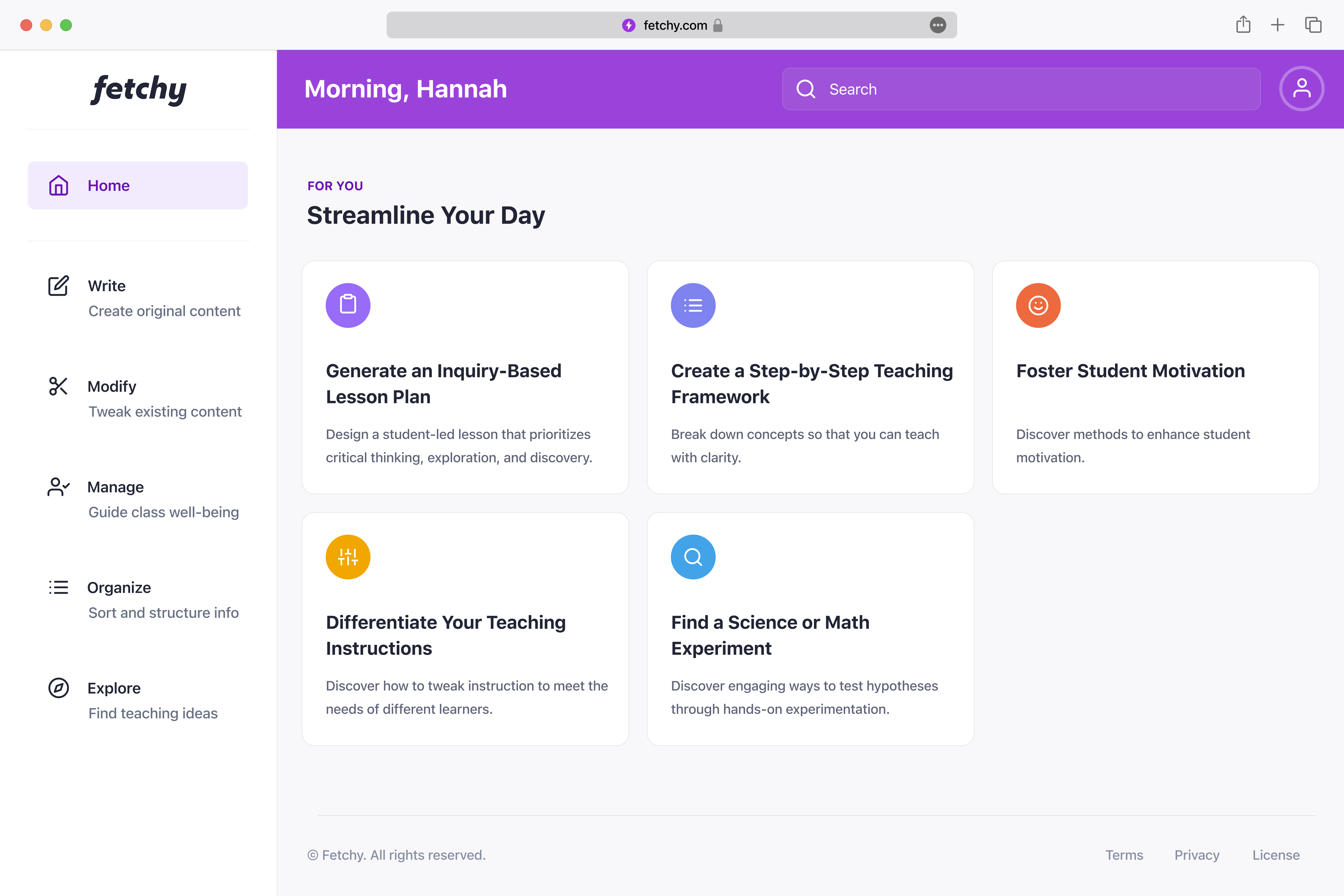
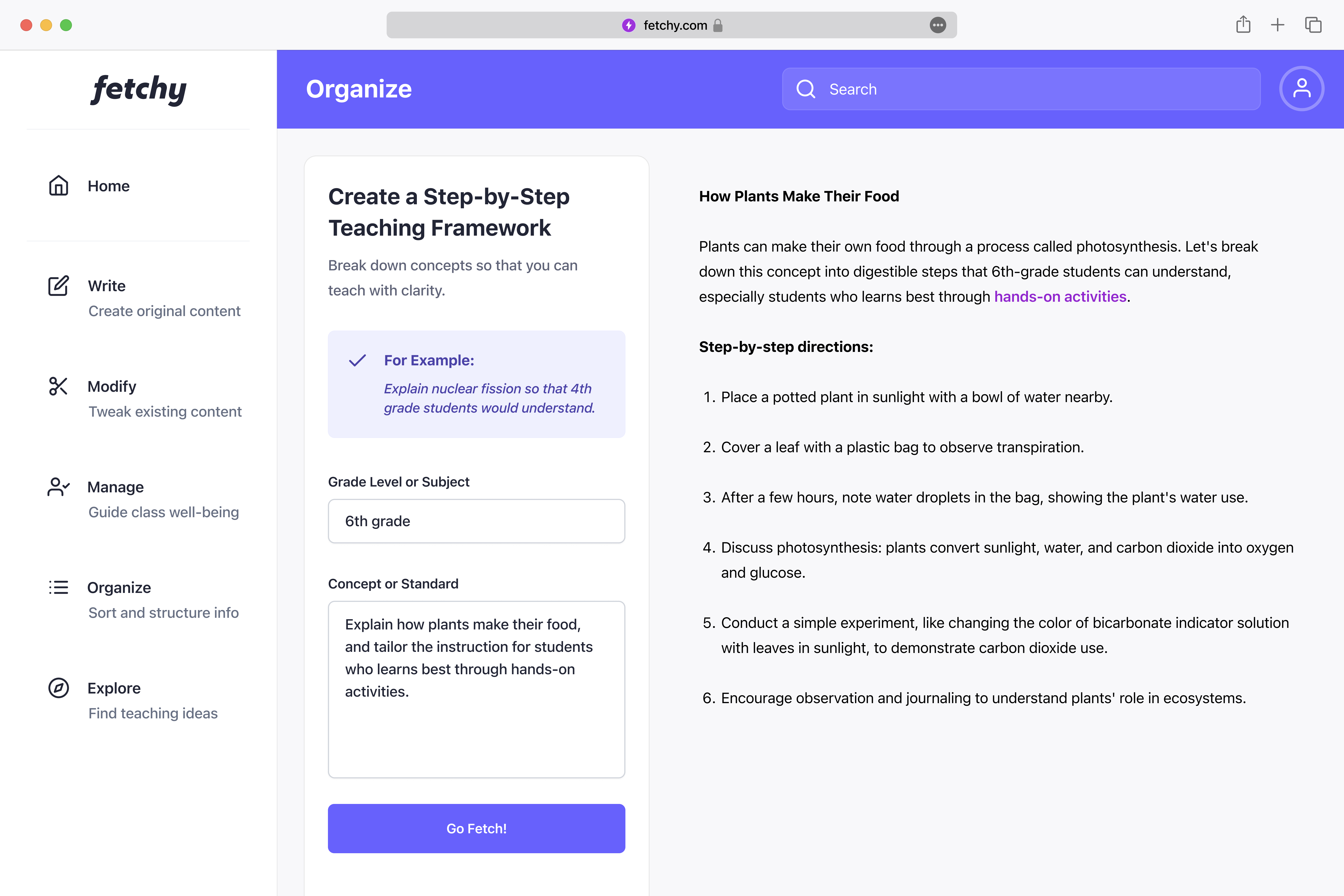
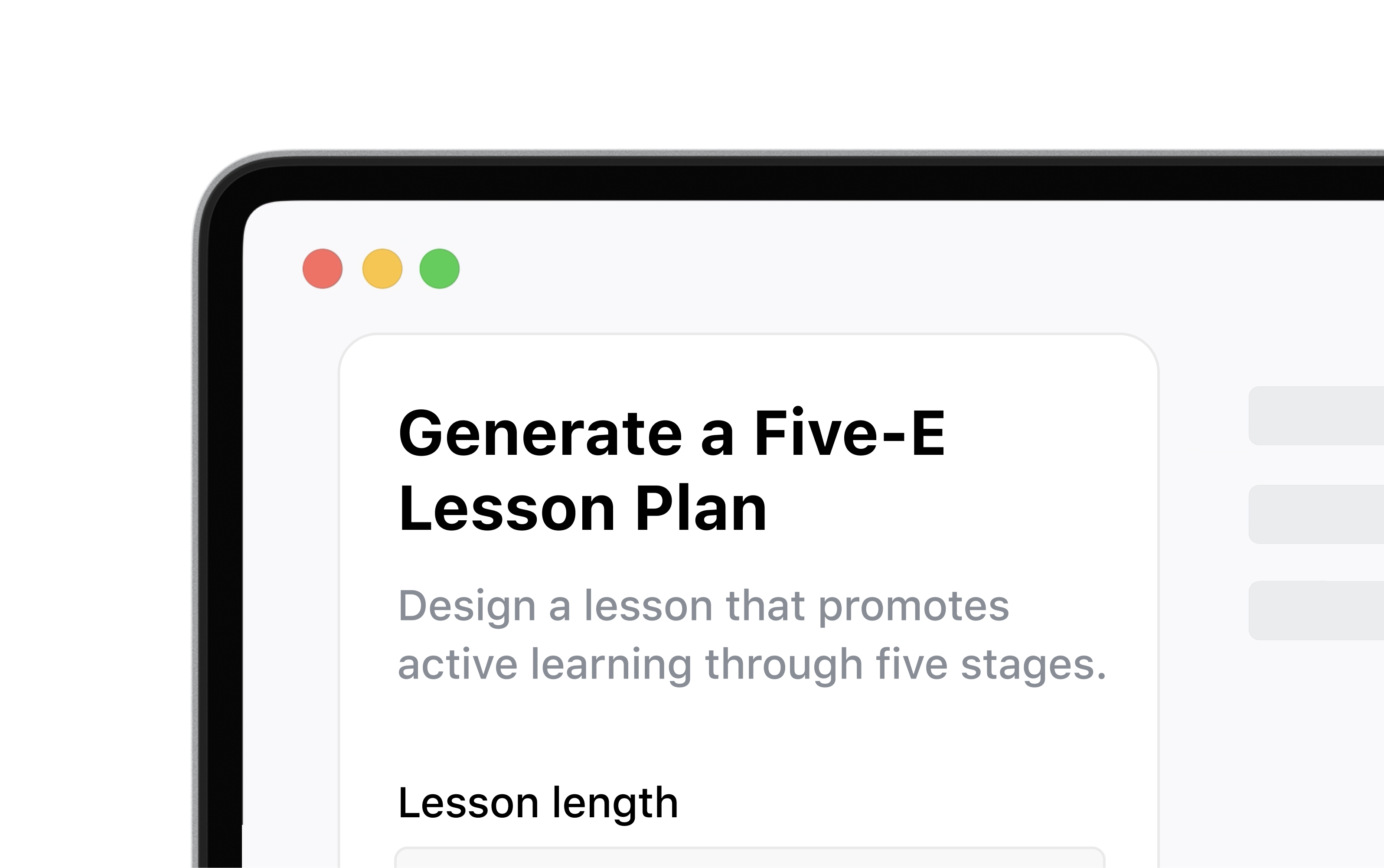
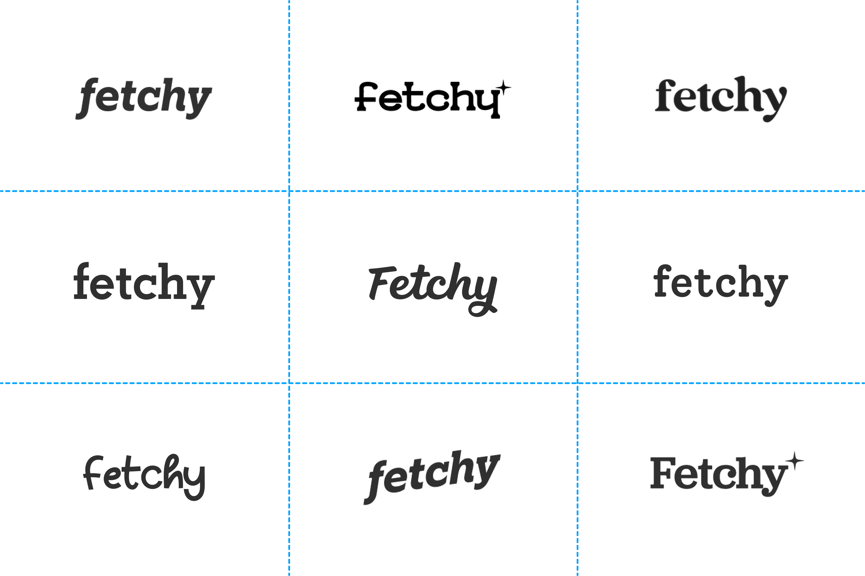
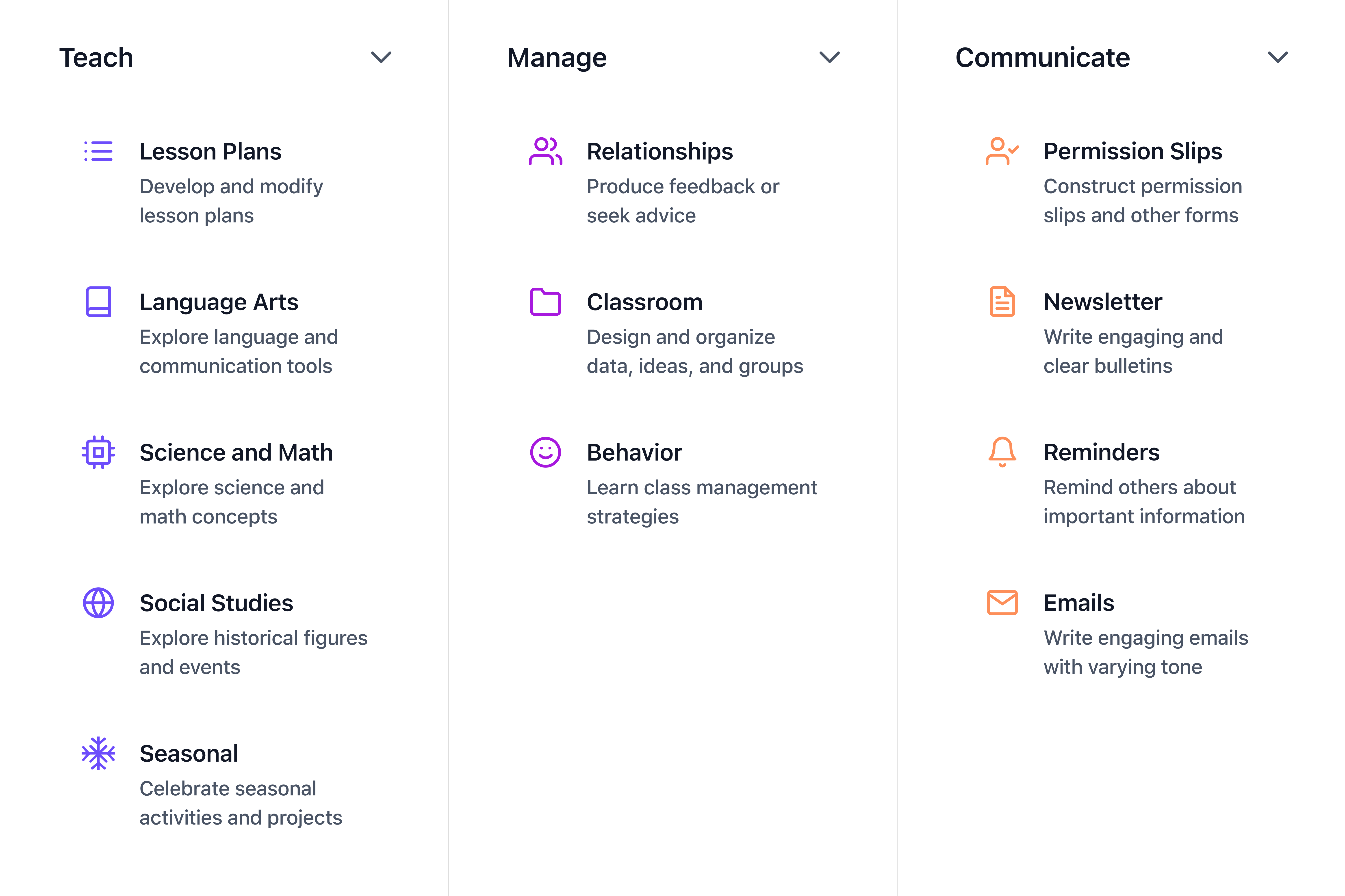
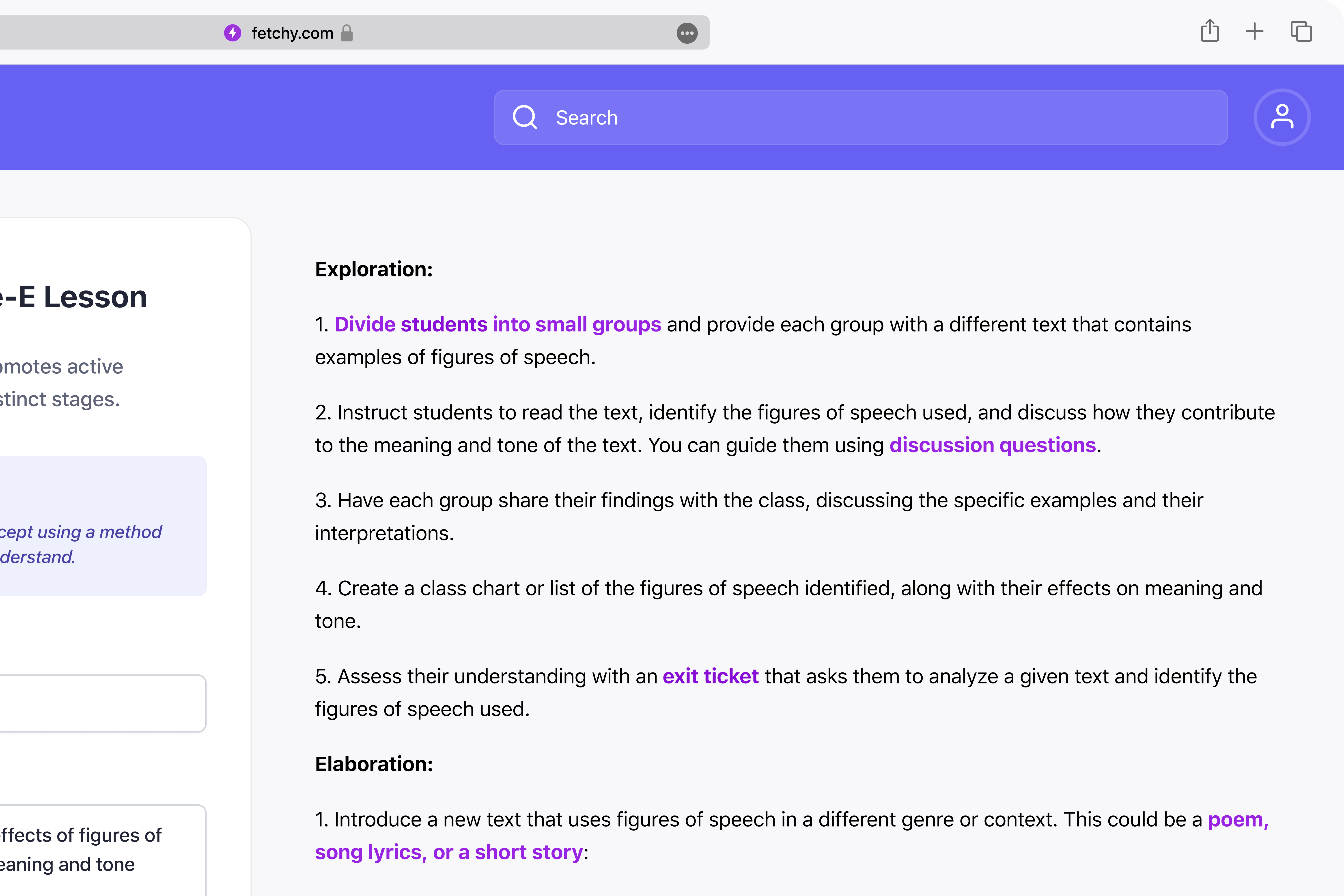
I crafted illustrations that embody whimsy and friendliness, ensuring clarity in our communication with teachers.
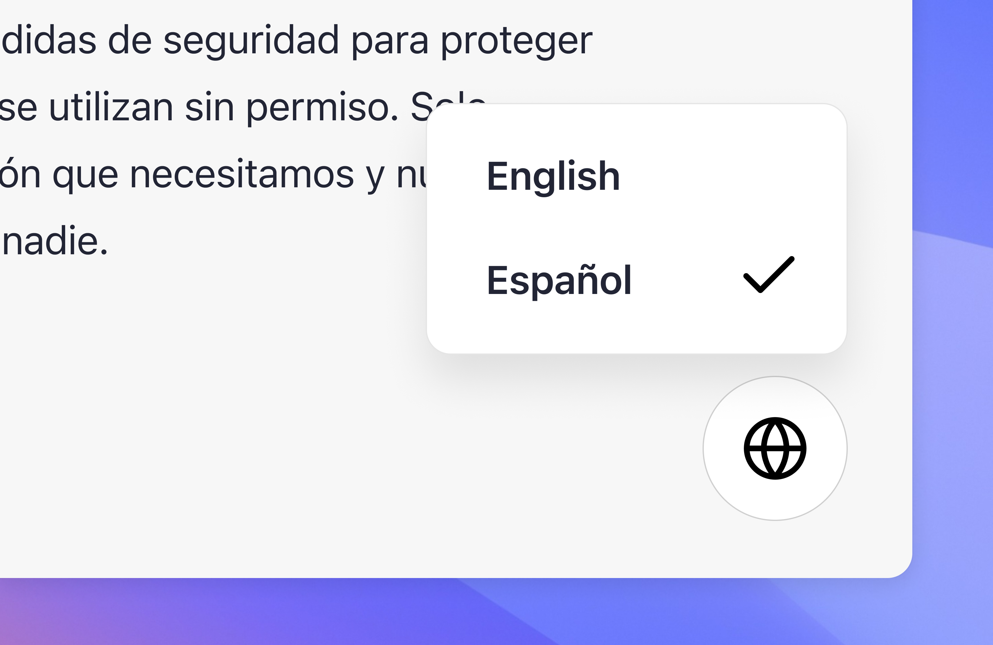
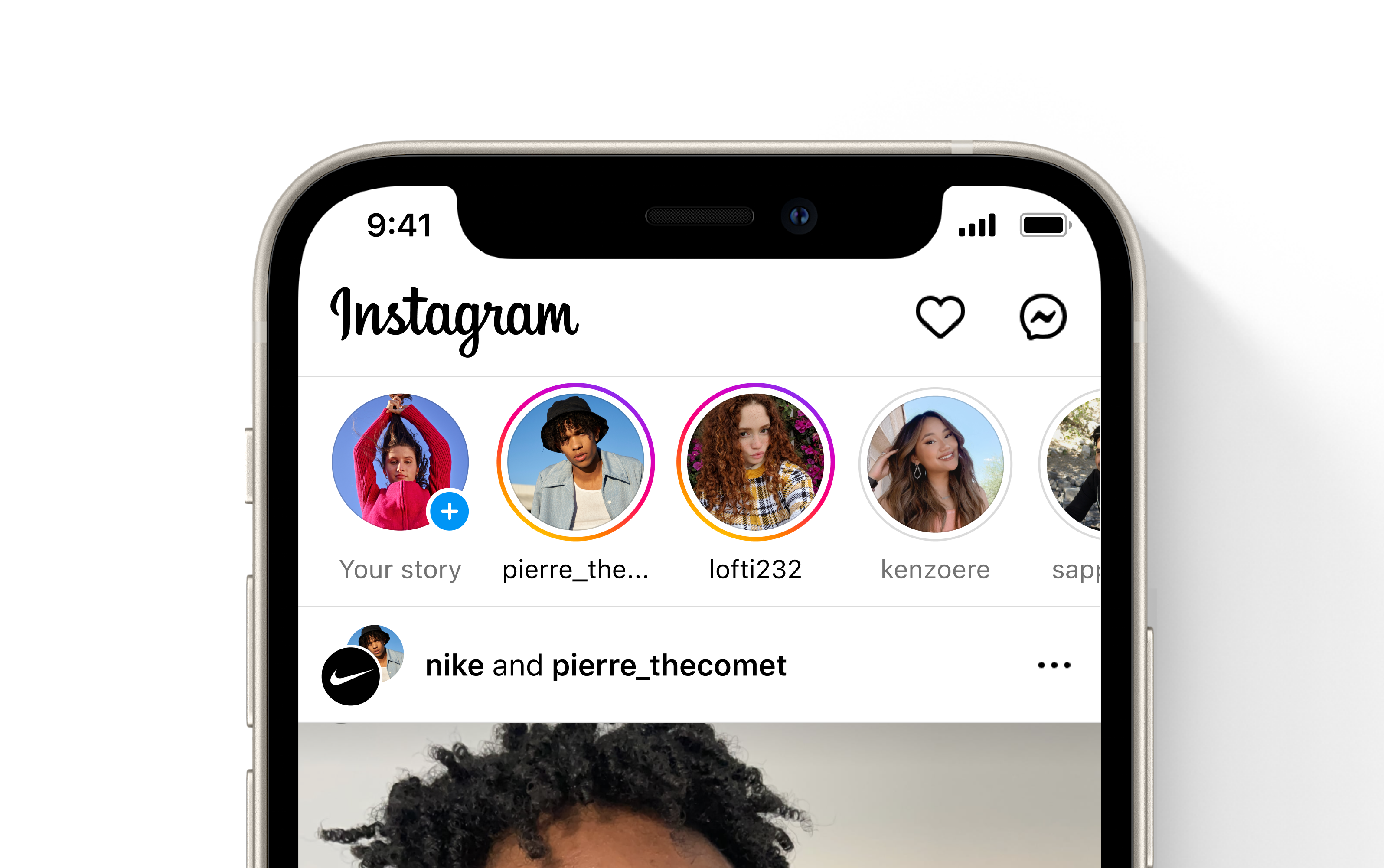
Our language switcher floats over the interface, intentionally enabling educators to switch languages at any time.

The education system is like a dinosaur – big, slow, and ready for extinction. Teachers are drowning in mundane tasks, losing the spark that got them into teaching in the first place.
Improving how teachers work required me to change how I worked. Imagine leaving a top tech company and joining a scrappy basement startup. That's the leap I took, driven by a conviction to support educators.


So, we pitched our "AI vision" to teachers and got blank stares. They looked at us like we were speaking Martian. In that moment, I had a realization — I didn’t understand anything about their world.
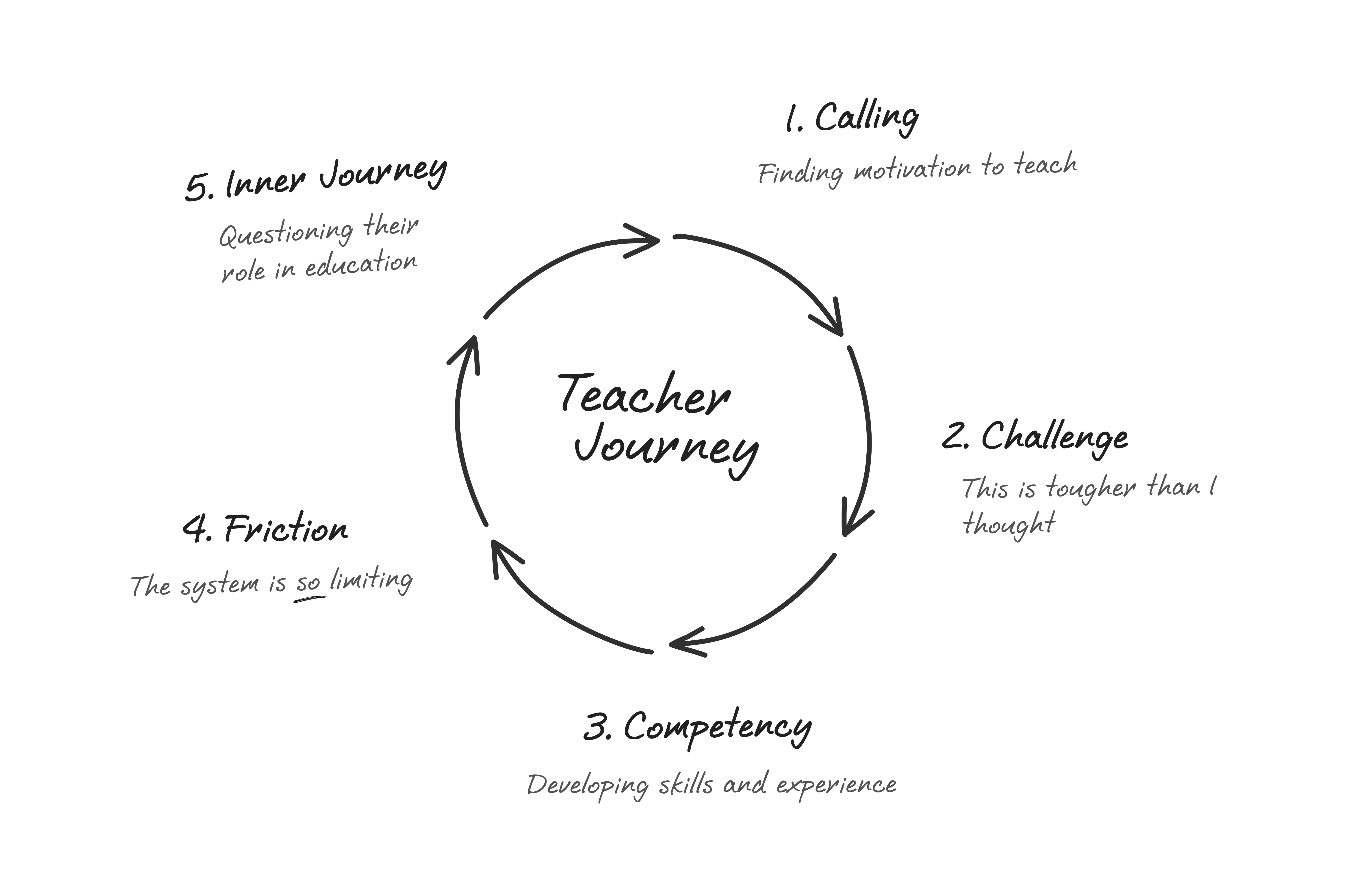
Diving into teachers' daily lives offered profound insights. I shadowed them at work. I interviewed them in the classroom. I learned a lot more than just their love for soda; I uncovered core principles that shaped our design direction.
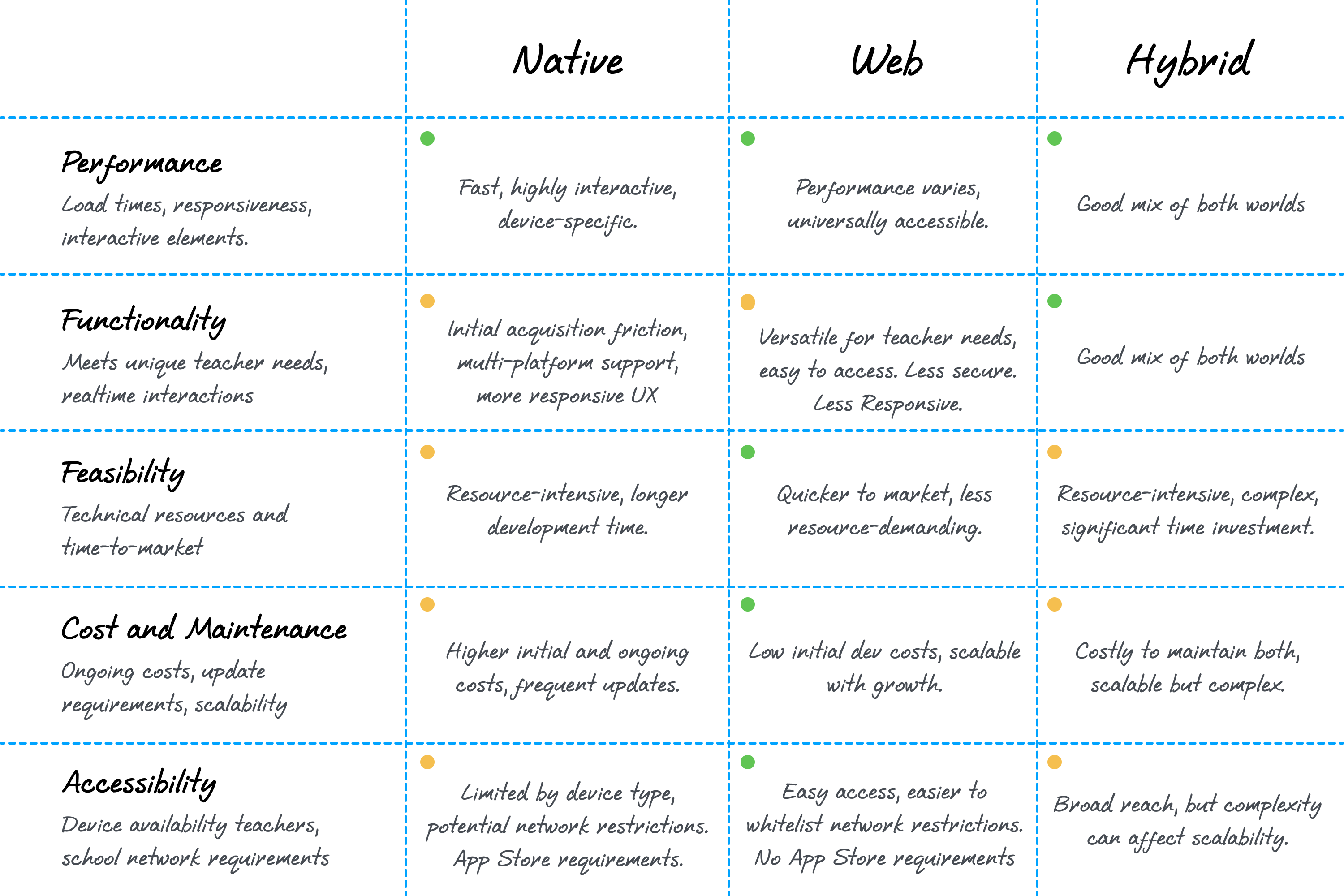
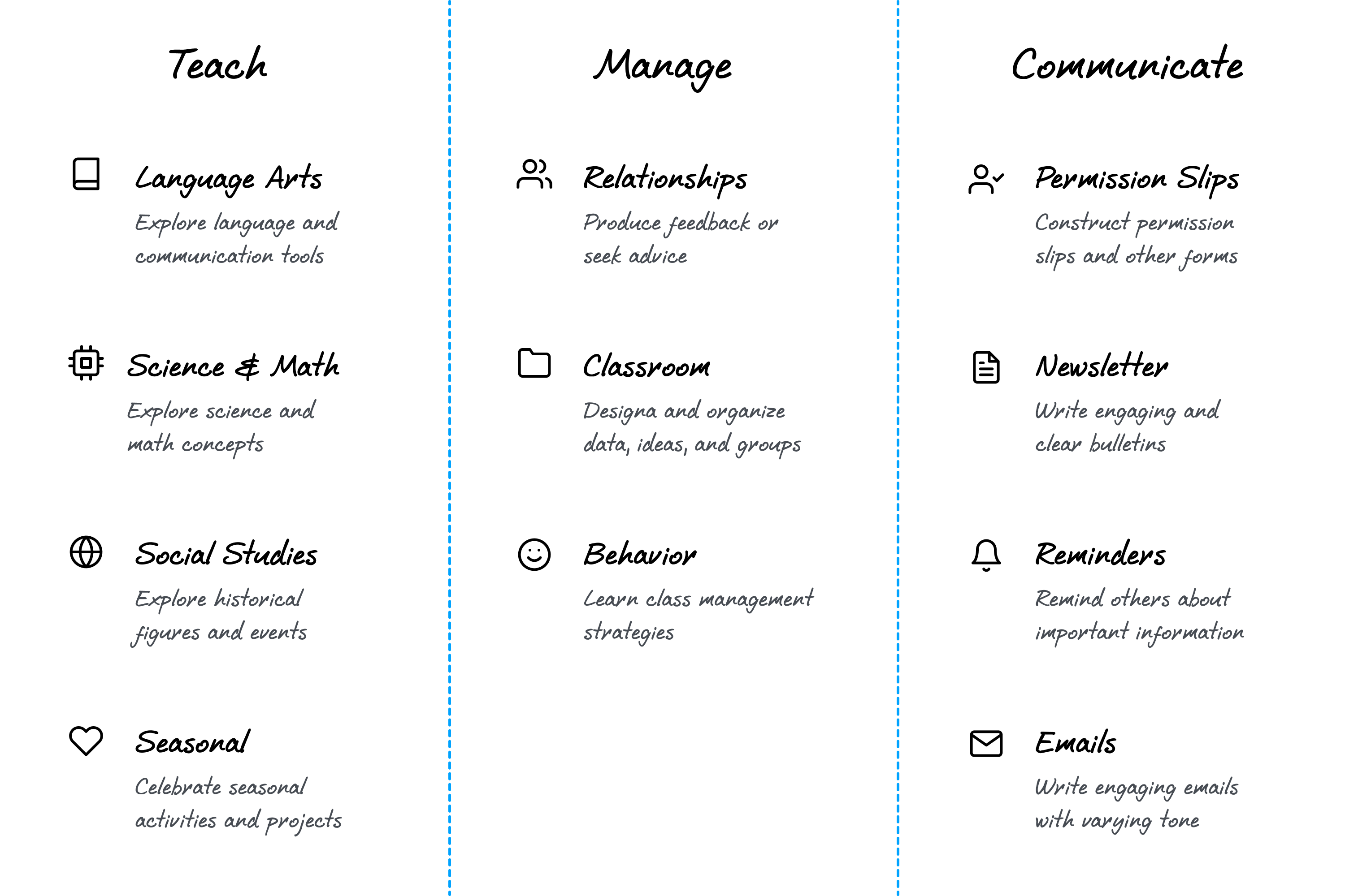
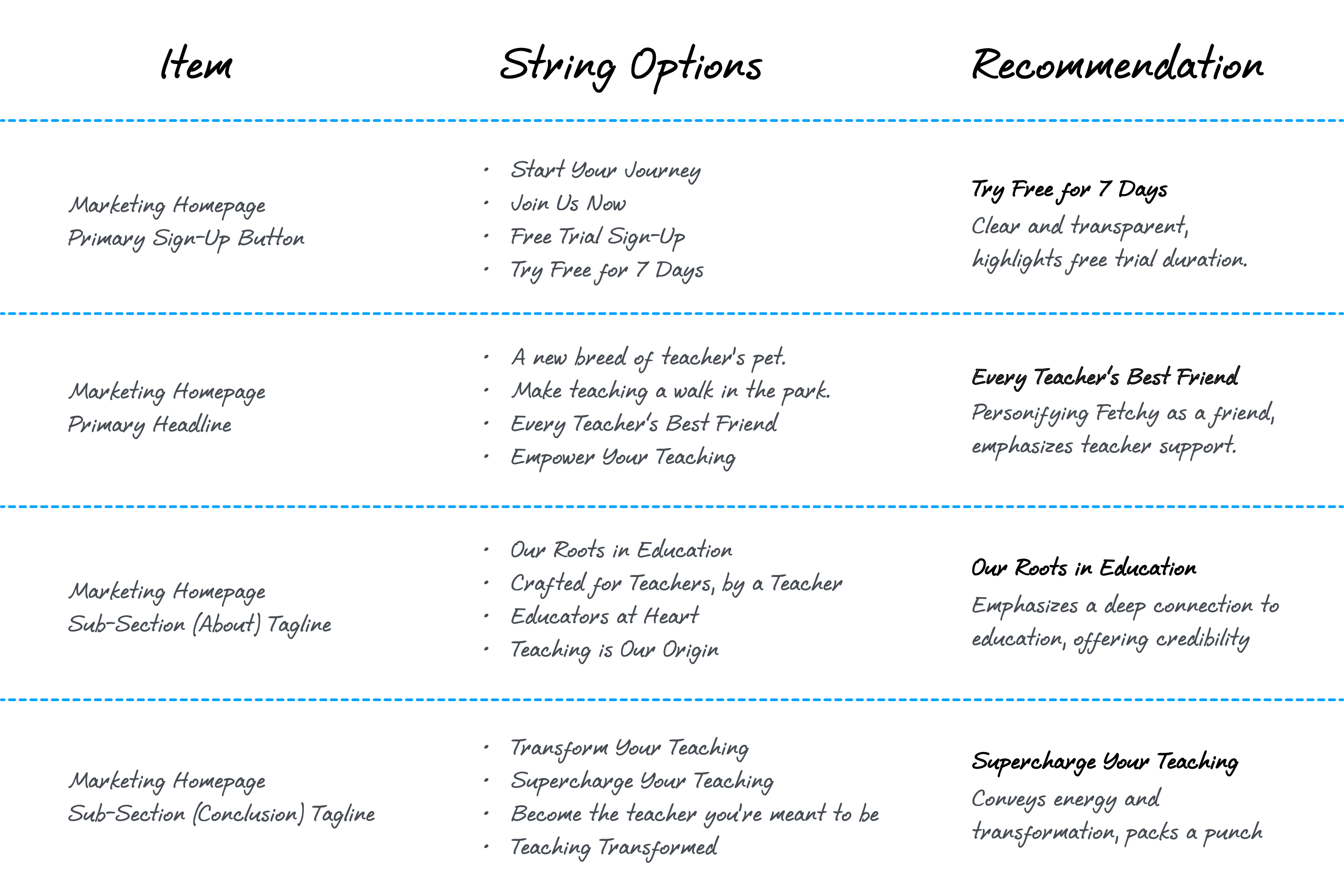
Starting a company is like navigating a maze, where every turn represents a critical decision. Guided by the insights from our research, we made strategic choices that shaped our product's path. Here's a few examples:
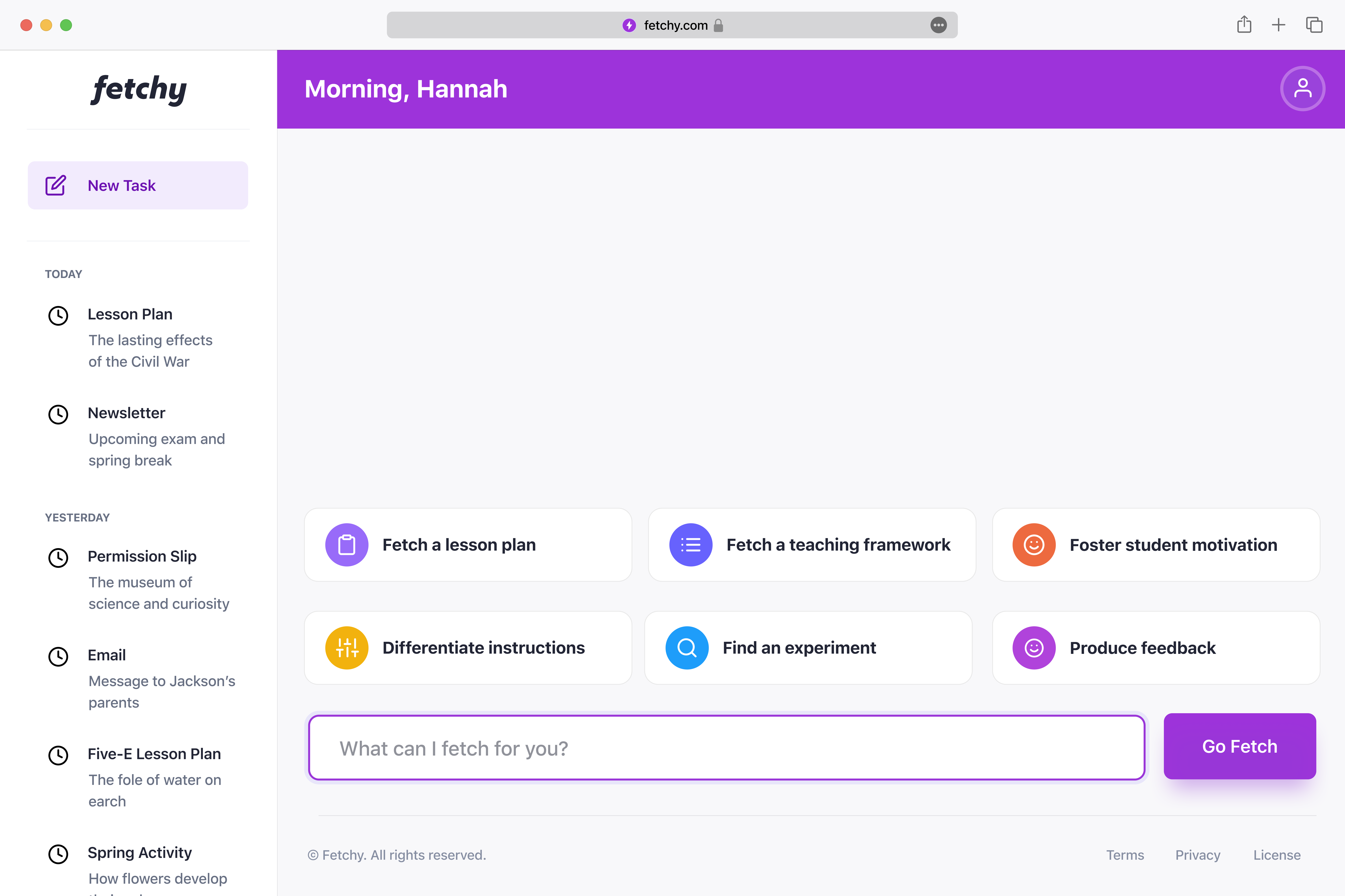
We aren't just selling software; we're selling empowerment. Fetchy is about teachers reclaiming time, rekindling their passion for teaching, and knowing they've got a loyal companion by their side.
Building a company from scratch is a great deal of work. From product management to engineering, and everything in-between, I did it all. Amidst the chaos, however, I discovered a deeper sense of purpose.